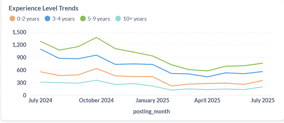
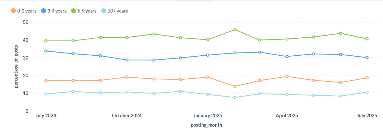
Same data, but the first chart shows the evolution of the relief job market by absolute numbers and the second one does it by percentage.
Often the percentage visual is more fair when doing comparisons that using absolute numbers. In this occasion, they are telling different sides of the same story quite accurately.
- Absolute numbers: There was a market-wide hiring slowdown. Fewer jobs were available for everyone.
- Percentages: Although the total number of jobs went down, the composition of the job market did not change. Organizations were looking for the same mix of experience levels throughout the year.
by absolute numbers
by percentage
For my Humanitarian Sector Employment Dashboard demo, I will choose the one by absolute numbers. It is more descriptive for a general audience.